Sector:
Wellness and lifestyle
We Delivered:
Business strategy, strategic visioning, IP review and valuation, IP protection advice, trade marking, brand strategy, brand narrative, visual narrative, behavioural narrative, brand identity, brand communication assets, livery, environment, stationery, brand guidelines, copywriting, strategic guidance.
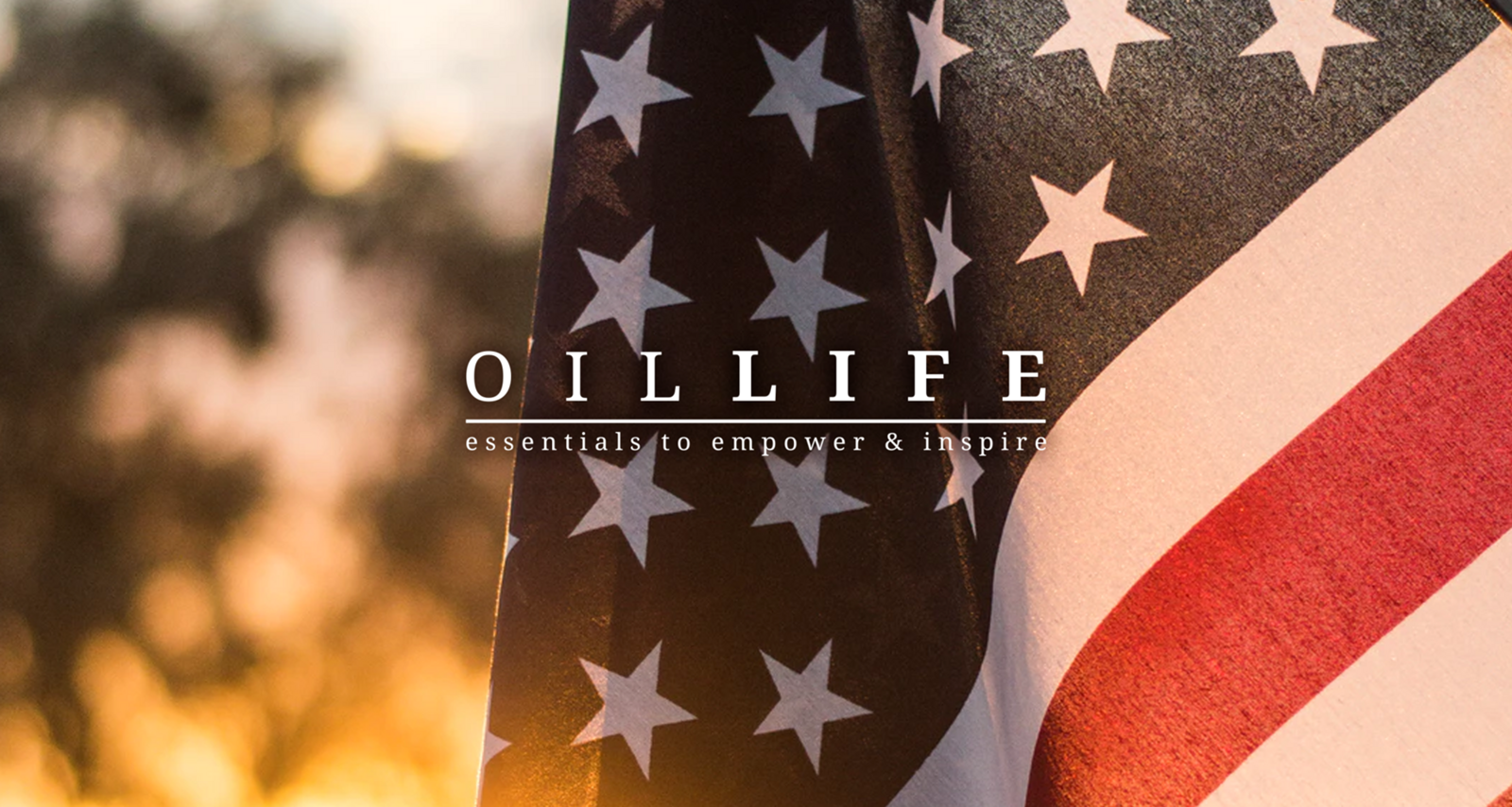
A legal letter from America challenging their trade mark was just the beginning.
Brand clarity sometimes comes out of adversity, or its challenger, positivity. Brand narrative comes out of the authentic belief those things give you. Vitalia is the perfect example.
Buying the Oils for Life (OFL) business was a natural extension of our client's essential oil, wellness and low-tox lifestyle business. The purchase included the Australian registered trademark and domain registrations. As well as the online and retail operations.
When they were challenged by an American company (Oil Life) for the use of the name "Oils for Life" they talked to Untold.
They had another brand in their brand family, Vitalia which incorporated the founder's personal businesses and influencer activities. Their first instinct was to simply rename the new business Vitalia and move on. However, we advised that the OFL brand was an asset with equity in the market and that while Vitalia may be a better masthead for their combined offerings they shouldn't just walk away when they owned the Australian trade mark.
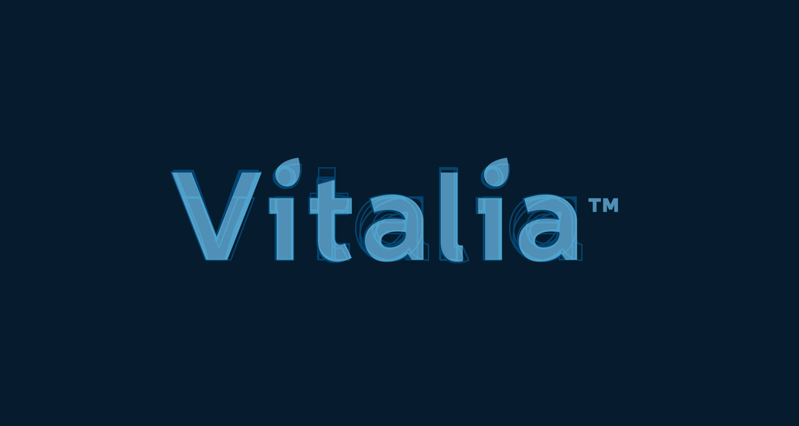
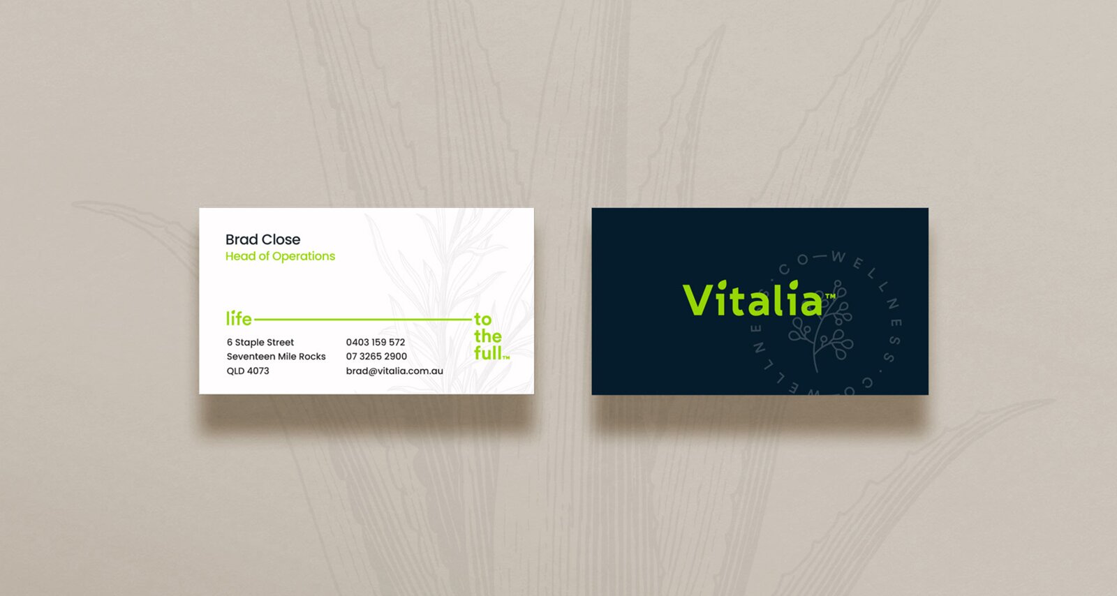
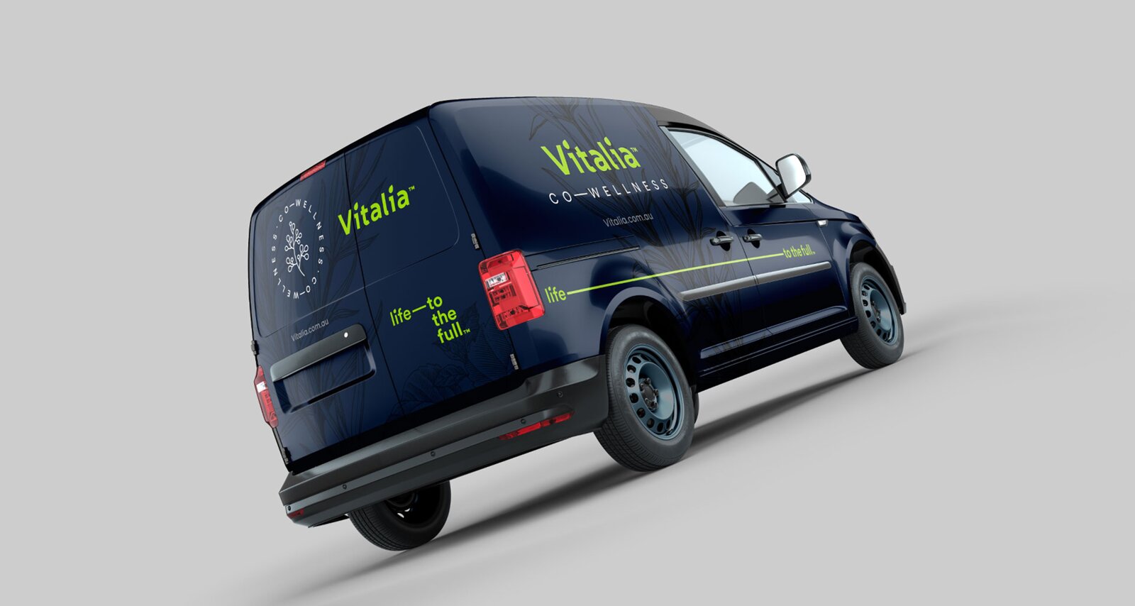
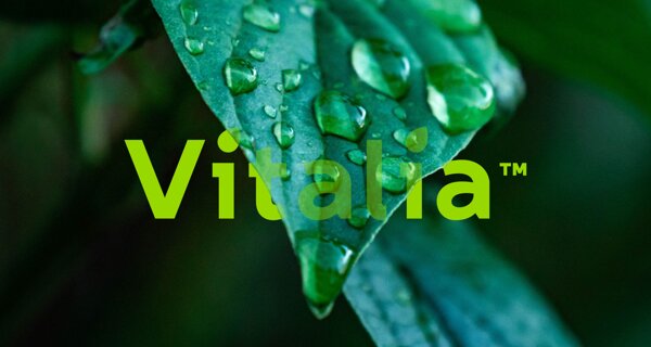
No font would have been perfect for Viatalia, so we created our own. Type was hand-drawn to incorporate several san serif styles. (Note the double-story 'a', the serif 'i', curved 'l' and the short ascenders.) A custom leaf/oil icon was employed here as the 'tittle' of the lowercase 'i'.
Life–to the full™ was designed as an anamorphic element. The line would stretch over spaces, even around corners, and onto other canvases. It became a dynamic tool useful for framing visual narrative, spaces, and document breaks.
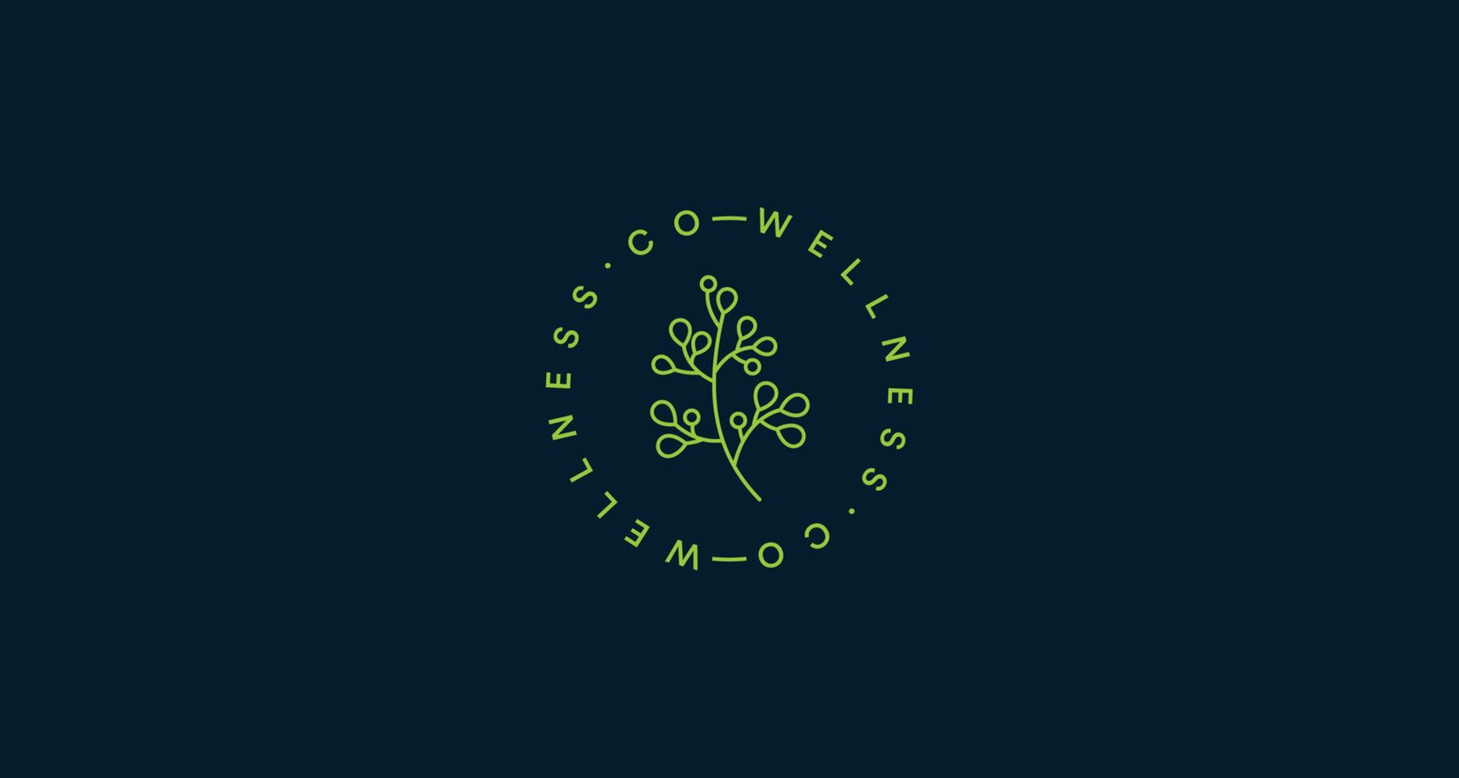
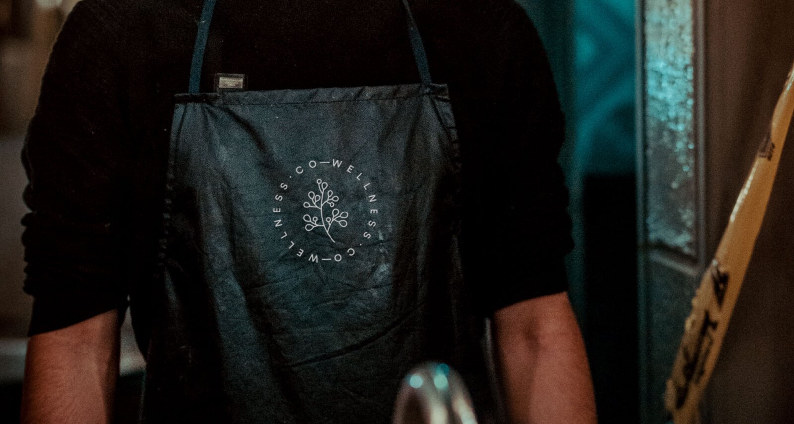
Co-wellness appears in a roundel with a custom illustration which spoke to the natural origins of their products as well as their network. The design also delivered a second message–the repetition meant that co-wellness also became the wellness.co.